
The Weebly divider element is one of the structural Weebly elements used to insert an horizontal line or horizontal divider into pages, posts, and products. The divider element is one of the most used Weebly elements, often placed in-between other content elements to create demarcations between the contents above and the contents below.
Although the divider element is one of the most widely used Weebly elements, there’s unfortunately no direct (or built-in) customization options for Weebly users to style the element to their preference.
The style of the divider is often predetermined by the theme and there are some custom Weebly themes with different design options for the divider element but in many cases and particularly with default Weebly themes, the design of the divider is a thin black, grey or transparent line.
How to Customize and style the Weebly line divider element
In this short tutorial, I will explain how to customize the Weebly divider element to have a design different from the default option available with most Weebly themes. To style the divider element you only need to copy and paste a line of CSS code into your Weebly theme file.
Important:
[1]. Because you will need to access Weebly theme files, you should take steps to backup your theme before making theme-level changes. See this tutorial on how to backup a Weebly theme.
[2]. After making edits to the theme files you might notice that the editor doesn’t load normally. This is not a major issue and it does happen with some Weebly themes. If you encounter the issue, this is how to fix it.
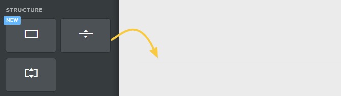
Steps to Customize The Weebly Divider or Line Element
- Step 1: Copy the code below
Copy the CSS code below to be pasted in your Weebly theme file.
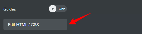
- Access theme Files
On your Weebly website editor, click Theme, click Edit HTML/CSS and wait for the theme files to load.
- Step 3: Paste the Code
Locate STYLES on the left (you may have to scroll down), look for main.less and click on that to open its code editor. Make a new line at the bottom of the code editor and paste the code you copied in ‘Step 1’ above.
If you are familiar with Weebly theme files, you can paste the code into a more applicable style file other than the main.less. Some premium Weebly themes like these ones provide a ‘custom.less‘ editor for all your custom codes ensuring that you do not have to interfere with the built-in theme CSS. - Step 4: Save your changes
Click the Save button at the top right corner. If this is your first time editing that very theme, you might be prompted to save the edited version by giving it name. If so, give it any name you want… for example: my_theme_v3.
- Add the divider element to your page
Drag and drop the divider element to your page and you see that it has the new design you implemented. Feel free to go back to where you pasted the code to further customize the divider element via the CSS code.
This is the code:
hr.styled-hr {
    height: 1px;
    background: #000000;
    opacity: 1;
    border: none;
}
Explaining the code:
height
sets the thickness of the divider line. In the code above, the thickness of the line is one-pixel (1px) you can change that to a different value to make the line thicker.
background
sets the color of the divider. In the example above, the color is black (#000000). You can replace the HEX color code with your preferred color.
opacity
sets the transparency of the divider. In the example above, opacity is set to “1” which means that the line has no transparency. To apply transparency you need to edit the value of opacity to your preferred value from 0.1 (most transparent) to 0.9 (least transparent).
For example:
opacity: 0.7;
border
adds border to the line. In these examples, the border is set to none (no border). We recommend leaving the default value of “none” because adding a border can distort the thickness of the divider. Use the height value instead to have better control of the thickness.
That’s it!