One of the design flaws we often encounter working on client Weebly website, especially when redesigning a Weebly website for clients is their approach or attempts to vertically align contents in columns. In many of these cases, the most common practice is to use the Weebly spacer element to adjust the columns alignment. This is a very bad practice and we will explain why.
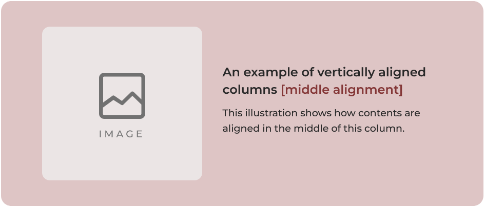
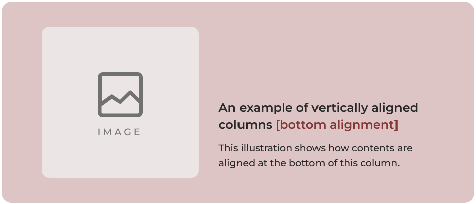
Contents on a column can be vertically aligned in three positions: top, middle, and bottom. But for the purpose of this tutorial, we will focus on ‘middle alignment‘ and ‘bottom alignment‘ seeing as ‘top alignment’ is often the default position that doesn’t require extra effort to be set.
Before we go further, it’s important that you understand what we mean by vertically aligning contents on a column. The below illustrations show two examples of vertically aligned columns: middle aligned and bottom aligned.
Why using the Weebly spacer element to vertically align columns is a bad practice
As mentioned above, one of our most encountered approach to vertically aligning columns on a Weebly website is by using the ‘Spacer’ element to push down the column contents in an attempt to align them vertically.
While this method might seem like a very quick and logical fix, we actually consider it a poor practice because it has a number of disadvantages, two of which are listed and explained below.
The 2 major problems with using the Weebly spacer element to align columns
#1. Precise Alignment
Because you have to manually drag the spacer down to adjust its height without any guides to indicate alignment position, vertically aligning the columns with precision is almost always impossible. This is particularly an issue with middle alignment.
#2. Mobile responsive consideration
Assuming you do not care about the precise alignment issue as explained above and you are happy with just having the contents somewhat aligned to the middle or bottom, there’s is still the question of “what happens when the side-by-side columns collapse into single row?” as they should on responsive devices (e.g. mobile, tablet/ipads, etc.).
And because the Weebly builder hasn’t provided options (unlike the likes of WordPress’s Elementor) for controlling individual elements on responsive devices, the spacer element that looked so useful for vertically aligning the columns for desktop view suddenly becomes a nightmare for mobile and other responsive devices.
Why a nightmare? Because when columns collapse on responsive devices, you do not have the option to hide the spacer element or reduce its height. This means that the spacer element gets in between the contents on the left column (e.g. an image) and the contents on the right column (e.g. texts) putting so much space between them such that they end up appearing as two separate sections with image all the up and the texts all the way down.
A possible fix for issue #2
Given the fact that the major issue with #2 is that the spacer element adds an extra space between the left and right columns on responsive devices, a possible workaround would be to put the spacer element at the bottom of the column. In this way, the spacer element pushes the column contents up to a preferred middle or bottom position rather than pushing the contents down.
This approach ensures that when the columns collapse, the spacer element will be at the bottom (i.e. at the end) of its column rather than in between the top/bottom columns.
But… there’s a much better practice to vertically align contents on a Weebly column without using the spacer element.
How to align Weebly columns vertically without using the spacer element
With most website builders, columns element have a setting for vertical alignment, but because Weebly hasn’t exactly kept up with other website builders in the areas of new feature releases, Weebly is yet to introduce an editor setting for aligning columns contents.
But not to worry, Weebly Expert created a workaround that you might find very useful in building your website. Our workaround involves styling the Weebly Section element, a part of it anyway, to vertically align contents of a column. For this approach, we will provide you with a code that you can simply copy and paste into your Weebly’s theme CSS/LESS file.
Important:
[1]. Because you will need to access Weebly theme files, you should take steps to backup your theme before making theme-level changes. See this tutorial on how to backup a Weebly theme.
[2]. After making edits to the theme files you might notice that the editor doesn’t load normally. This is not a major issue and it does happen with some Weebly themes. If you encounter the issue, this is how to fix it.
Steps to vertically align contents of Weebly columns in the middle or bottom
- Step 1: Copy the below code
Copy the short code below to paste into your Weebly theme file or header code.
- Step 2: Access theme Files
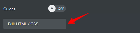
On your Weebly website editor, click Theme, click Edit HTML/CSS and wait for the theme files to load.
- Step 3: Paste the Code
Scroll down to STYLES, click the main.less code editor. Make a new line at the bottom of the code editor and paste the code you copied in ‘Step 1’ above.
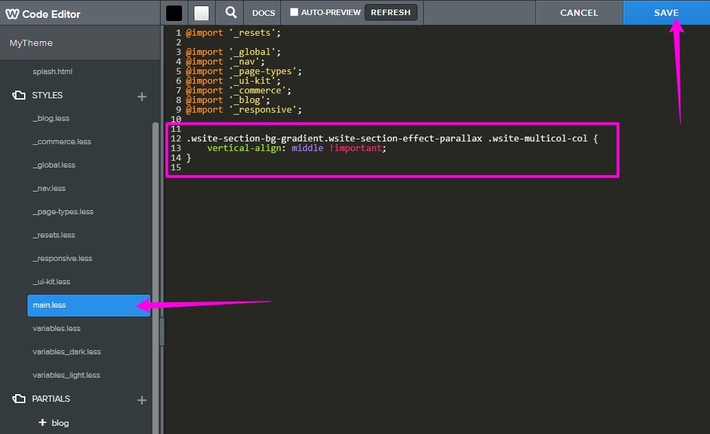
- Step 4: Click Save
If this is your first time editing the theme, you might be prompted to give the theme a name. If so, give it any name you want… for example: my_theme_v2.
- Step 5: Add Section element to page
Drag and drop the Weebly Section element where you want:
> click on that section and click ‘Edit Background‘
> click ‘Gradient‘
> click ‘Change Gradient‘
> select the colors. If you want the background color of that section to be a solid color then you should choose same color for both the first and the second color. For example if we want black color, then both colors would be #000000 to have a solid black background color.
> after choosing your colors, click the back arrow “<“ to go back one step.
> click Scrolling Effect, select Parallax and click away. - Step 6: Build your columns
Drag and drop elements on that section to create columns. You will notice that the added elements of that columns are vertically aligned in the middle.
This is the code:
.wsite-section-bg-gradient.wsite-section-effect-parallax .wsite-multicol-col {
    vertical-align: middle !important;
}
If you need the columns to vertically align at the bottom, then simply change “middle” to “bottom” (without the quotation marks).
That’s it!